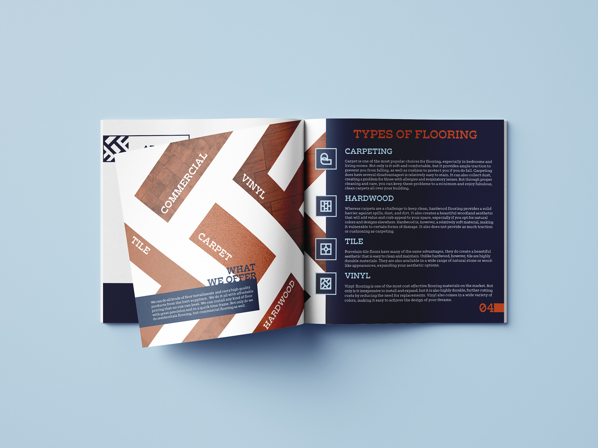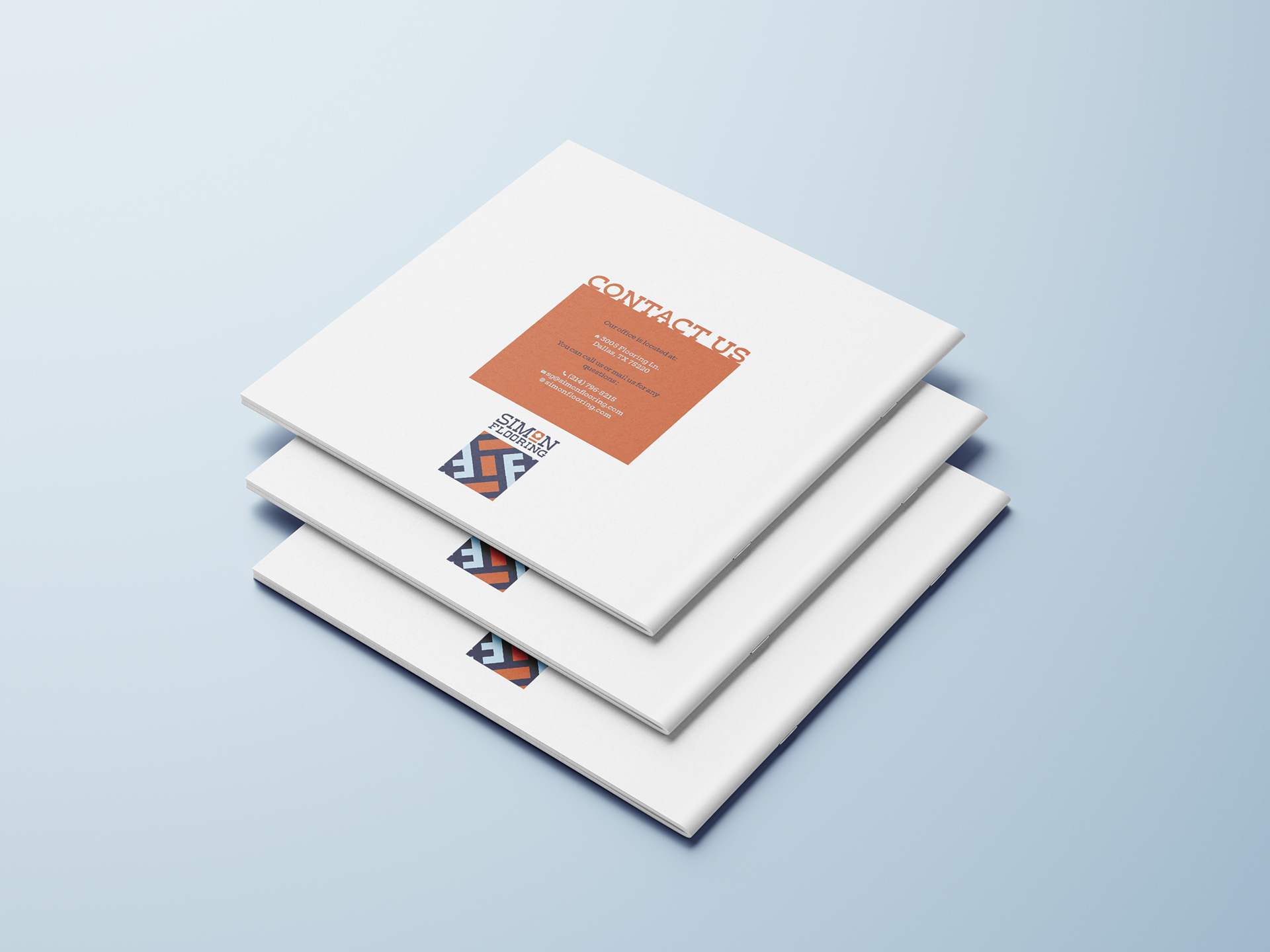
Simon Flooring is a branding project I envisioned for my father's old carpeting business. My father is a floor installing expert with more than 20 years of experience. He has installed tiles, carpets, wood floors, and vinyl floors all over the DFW metroplex. He used to own his own warehouse back in the day. This is the brand I would have created for that business.
My father is your average, humble, hard-working family man. I wanted to bring those qualities into his brand to life. I want the customer to feel at ease when they are receiving the best, most efficient, affordable flooring services. The target audience are homeowners, families, and business owners with incomes from $40,000 to $100,000. We provide residential and commercial flooring.
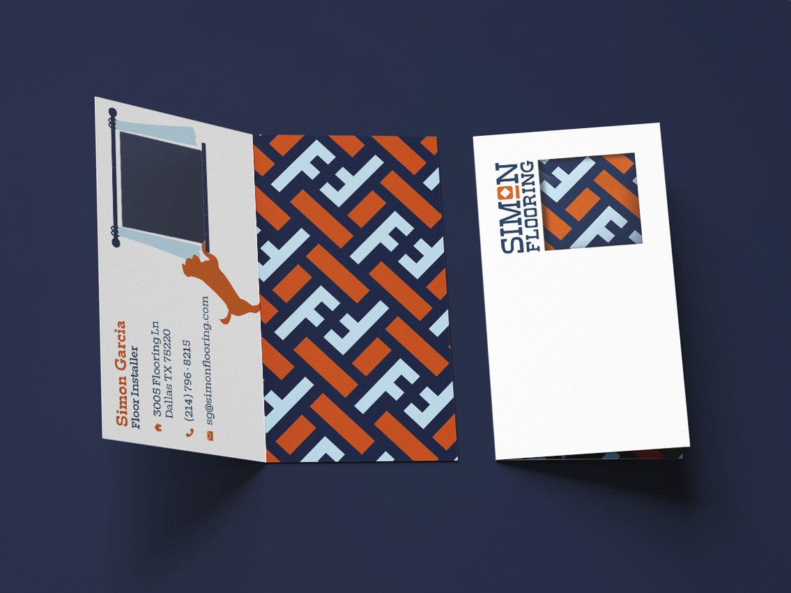
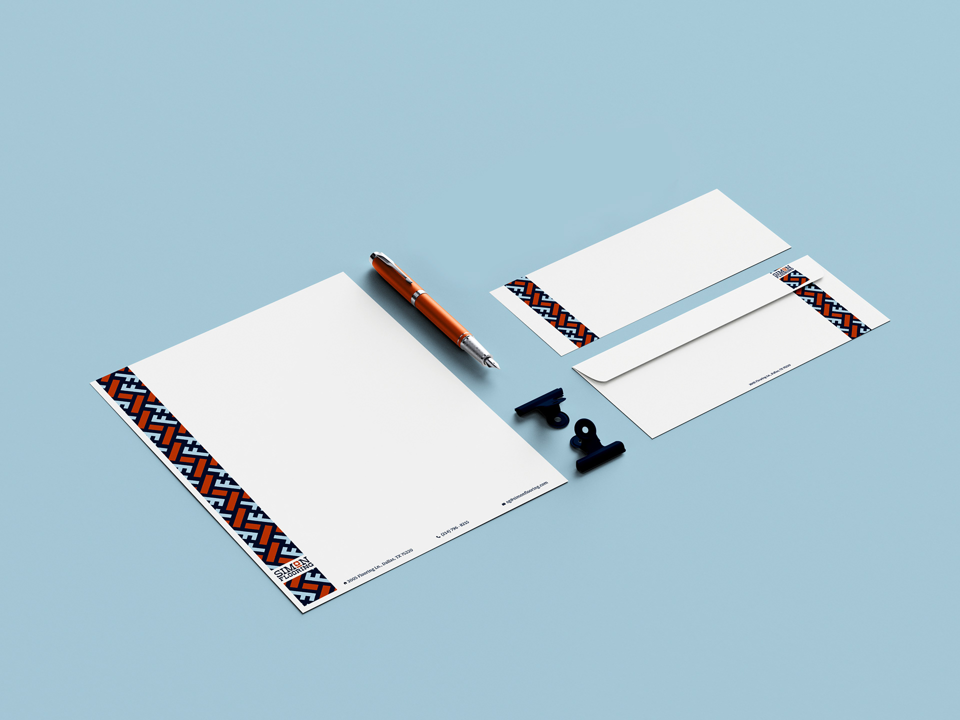
The typography gives the brand a structured, trusting feel, meaning that every floor was installed is meant to be durable and long lasting. The logo is inspired by tile flooring. The logo creates an "S" shape from the zig zag orange tiles, while the other "tiles" on the side are shaped as the letter "F". The "S" and "F" stands for Simon Flooring, the business name. The color orange represents the efficiency and hard work put in every job, and the blues shows trust and reliability. I also introduced other icons throughout the brand. For example, I added a depiction of our family dog to give the whole brand a more family-friendly charm while also keeping the brand very traditional and structured.